Mapping COVID-19 Vaccination Status in Philadelphia
INTRODUCTION
In this story, I explored the COVID-19 vaccination status across different pincodes in Philadelphia, using geospatial analysis to visualize the distribution of first doses, second doses, and booster doses.
EXPLORATION
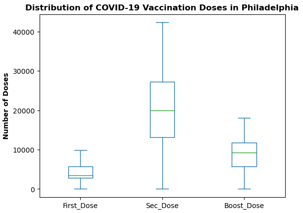
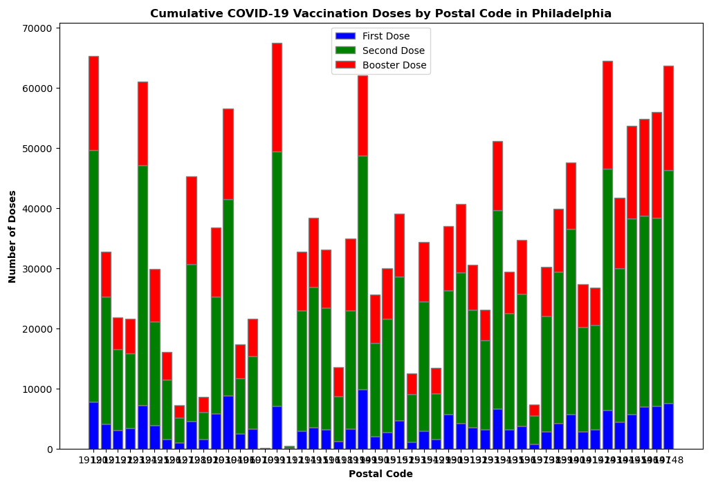
The dataset provided includes critical information on vaccination counts at the pincode level within Philadelphia. Each record contains attributes such as pin code, geometry information and counts of the first dose, second dose, and booster dose administered. The data exploration begins by examining the CSV file, which contains the vaccination counts along with the corresponding geographical data for each district. During the initial exploration of data, graphs shown below reveals that there is significant variability in the number of doses administered, indicating possible disparities in vaccine access or uptake across different regions.
Geocoding
To visualize this data, the CSV file must be geocoded and converted into a format suitable for spatial analysis. By using the latitude and longitude information of a location begins the process of transforming the CSV data into a shapefile format. Shapefiles are essential for geospatial analysis as they allow the data to be overlaid on maps, making it possible to visualize the spatial distribution of vaccine doses.
MAPPING
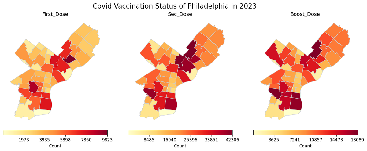
This geospatial analysis provides valuable insights into the vaccination distribution across Philadelphia. By visualizing the data, we can identify areas with lower and higher vaccination rates. Each map uses a color gradient to represent the data, with darker shades indicating higher vaccination counts. From these maps, it is evident that certain pincodes have significantly higher vaccination rates compared to others, particularly in the center and southern parts of the city. These areas may have had better access to vaccination centers, higher public health engagement, or demographic factors contributing to higher vaccination rates.